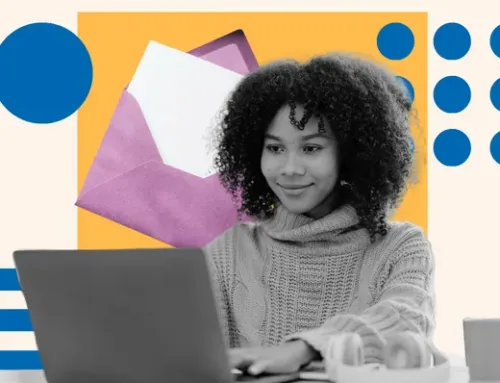
Last week, I was drinking coffee when an email from Adidas popped up.
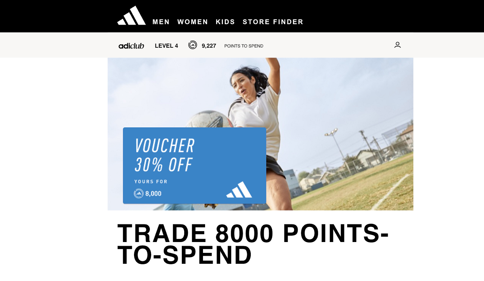
At the top, I could see my 9,000+ loyalty points displayed prominently in the banner, along with an offer that immediately caught my attention: a 30% discount on my next purchase if I redeemed those points.
I quickly forgot my initial plan for a quiet coffee and was intrigued and excited by the potential savings. Points I’d accumulated from previous purchases, which I hadn’t thought much about, now seemed like gold.
That’s precisely what an impactful email banner does. It tempts you and turns a routine email check into an exciting shopping spree.
Here, I’ll share what an email banner needs to include to have that effect and highlight seven of my favorite email banners that haven’t only caught my eye and compelled me to take action.
![→ Download Now: The Beginner's Guide to Email Marketing [Free Ebook]](https://no-cache.hubspot.com/cta/default/53/53e8428a-29a5-4225-a6ea-bca8ef991c19.png)
What is an email banner?
A banner is a visual element at the top of an email that complements the marketing copy.
A banner is a great way to immediately set the tone for the message’s content and to create a lasting visual impression in the recipient’s mind.
Here’s what that exciting email banner from Adidas looked like:
Brand banners can range from simple designs featuring the brand’s name and logo to elaborate promotions.
These banners differ from signature banners, which you can find at the bottom of an email.
Banners are designed to capture your attention right from the start, while signature banners typically contain contact information, a professional sign-off, or links to social media handles.
What to Include in an Email Banner
While email banners have plenty of room for creativity, a few standard elements are a no-brainer. Include these elements for an impactful banner:
Brand Logo or Name
A brand logo and name in your header is the first thing people see. It sets the tone for the rest of your email content, reinforces your brand identity immediately, and lends credibility to your message.
For example, here’s a banner from PayPal featuring its logo:
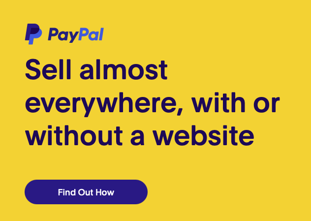
See how the design is simple and the logo visually apparent? Follow the same guidelines to incorporate your brand name and logo. PayPal’s background colors also complement each other and don’t clash.
Lastly, consider the size of your logo and name — PayPal’s logo is large enough to be easily recognizable but not so large that it overpowers the rest of the banner’s content.
Brand Colors
Using your brand colors in your email banner reinforces brand identity and ensures visual consistency. It’s much easier for recipients to recognize your email as a visual signature.
The key is not to play with too many colors. Keep your brand look professional and cohesive by using a limited color palette. Also, ensure the contrast between the background and text colors is enough to make your content readable.
Link to Your Website
Adding a link to your website in your email banner is a strategic move and is especially relevant for e-commerce emails. It provides a direct pathway for recipients to shop or explore your offerings.
For an e-commerce clothing store like H&M, links to specific categories guide customers to what interests them and make the shopping experience smoother.
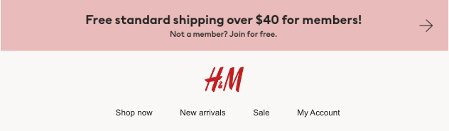
Pro tip: Make these links visually distinct and easy to find. Use clear, concise text or icons that represent each category.
Apart from this, ensure these links are mobile-friendly, too, since 56% of marketers use mobile-friendly emails in their email marketing strategy — and you don’t want to fall behind.
Current Promotions or Announcements
Highlighting current promotions or offers can reduce bounce rates and put your best deal front and center so nobody misses it.
A banner featuring a special sale, event announcement, discount code, or limited-time offer adds a sense of urgency to your message, encouraging subscribers to act quickly and not miss out.
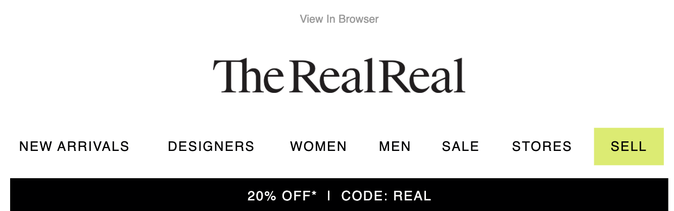
Make the promotion clear and straightforward with bold, legible fonts and colors that make a statement but still fit your brand’s look. It’s also essential to keep the timing in mind.
Keep your audience engaged by updating your banner with the most relevant offers.
Personalization Elements
Personalization elements, whether email or SMS, make any message feel more tailored and engaging to each recipient.
Litmus’ research shows that 80% of customers are more likely to purchase a personalized experience. And why not?
Customized emails are like greeting someone by name when they walk into your store — it makes the interaction feel more personal and welcoming.
Personalization can be as simple as including the recipient’s name in the banner or as complex as showcasing products based on browsing history.
Start with the basics. Use your email platform’s personalization tokens to insert names or relevant details into your banner. But keep it relevant, too. Make sure personalized content aligns with the recipient’s interests.
You increase your chances of making a meaningful impact with this approach.
The Best Email Banners
I’ve shared some examples and fundamental elements of email banners earlier, but how do you bring these together?
In this section, I’ll share seven of my favorite email banners that are unique in their way and will get your creative juices flowing:
1. Hootsuite
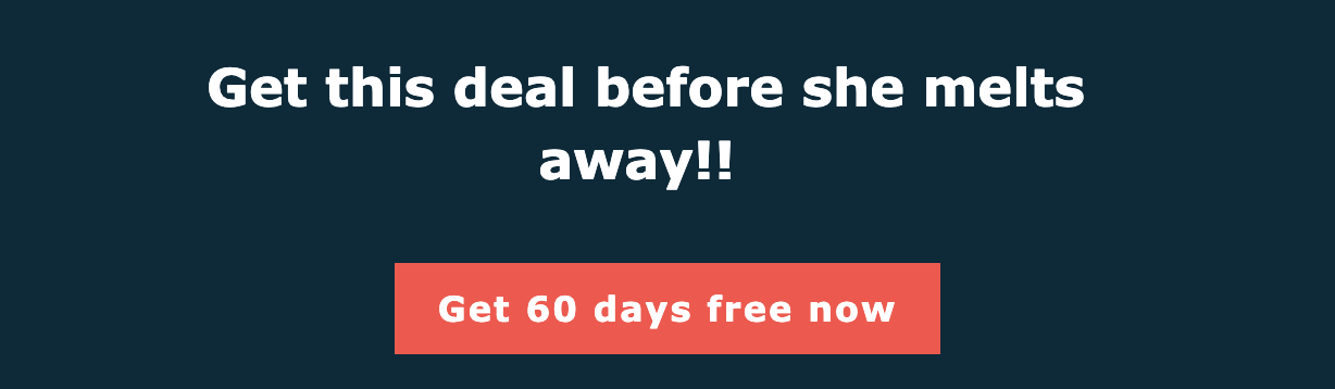
I love Hootsuite’s email banner. The tagline, “Get this deal before she melts away!!” adds personality and character to the email. This creative touch made the email memorable; I remember it even days later.
The brand also stuck to its brand guidelines with consistent colors and fonts. While the message is fun, it’s still unmistakably Hootsuite. This consistency reinforces brand identity in my head and cements these colors’ association with Hootsuite.
What I like: An orange-ish red for the CTA button was strategic. Research shows that red tones convey urgency and importance, encouraging me to click through. The color choice also fits within Hootsuite’s brand guidelines.
2. Old Navy
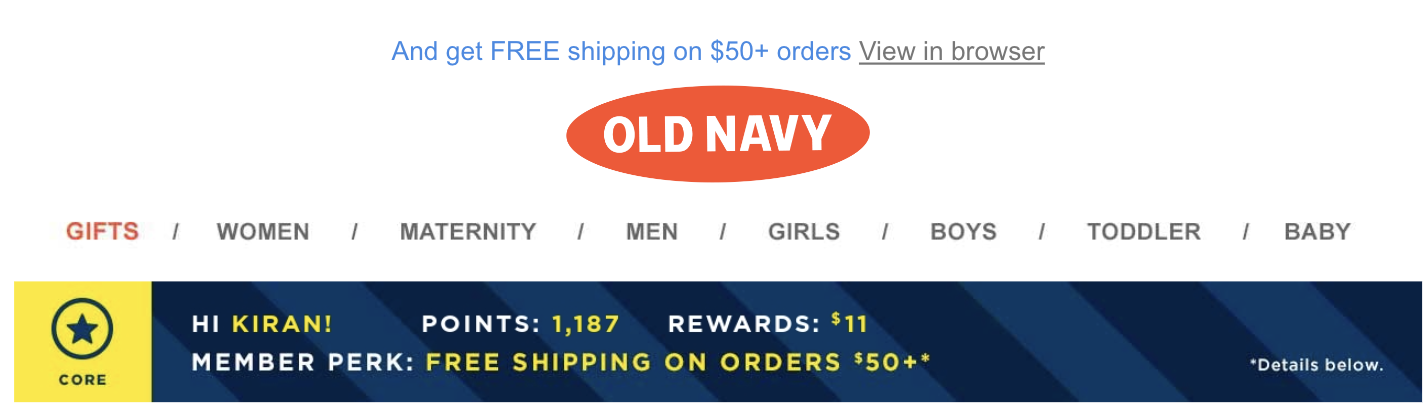
Old Navy’s email banner did a great job of making me feel like a loyal customer. I learned about an offer with the tagline “get FREE shipping on $50+ orders” and how it integrates personalized elements to improve my shopping experience.
Links to categories such as women, men, and gifts also make it easy for me to shift my focus to the website.
What caught my eye was how the banner summarized my rewards and points and even included my name. This personalization makes the shopping experience convenient and relevant by giving me a snapshot of where I stand.
What I like: The banner creatively uses space to combine several elements (offers, navigation, and personalization) without overwhelming me. It’s this balance between information and design that gets the message across.
3. Amazon Business
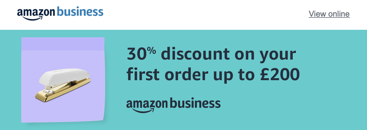
Amazon Business’s email banner caught my eye with its transparent, straightforward approach. It highlights a 30% discount on my first order up to £200 (around $252.64 USD), an offer that was hard to ignore for me.
What’s smart about their design is the clean, simple background they chose. There aren’t too many distractions, making the discount offer the show’s star.
The picture of the stapler in the banner is also quite cute. This fun and relevant element speaks directly to me and my needs and makes the entire message feel personalized and thoughtful.
What I like: Including a common office item, like a stapler, cleverly emphasizes the relevance of Amazon Business’s offerings to the everyday operational needs of small businesses.
It’s a subtle yet effective way to connect with the audience on a practical level.
4. Shopify
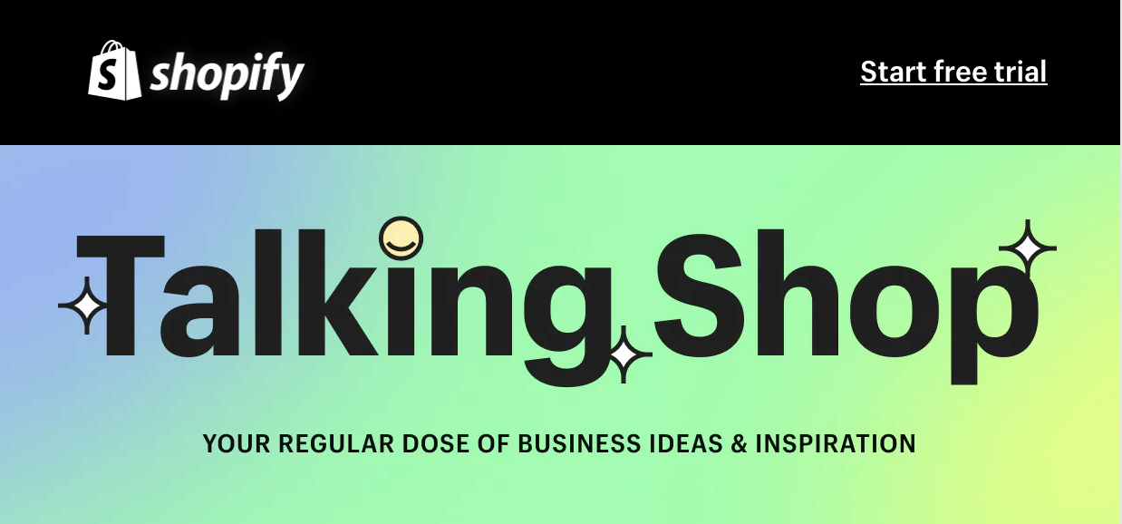
This headline and tagline combo from Shopify immediately resonates with me as a business owner. It promises constant ideas to help me keep my business competitive and creative.
The playful visual elements like stars and a smiley in place of the “i” dot also added a lighthearted, approachable feel to the banner.
These graphic elements and the gradient background make the banner attractive and reinforce that Shopify makes business fun and easy.
What I like: The inclusion of the Shopify logo and a subtle “Start free trial” text at the top right corner offers a clear next step without being too pushy.
I like how it’s a reminder that behind the engaging content and the vibrant community lies an opportunity to directly experience what Shopify offers.
5. Outreach
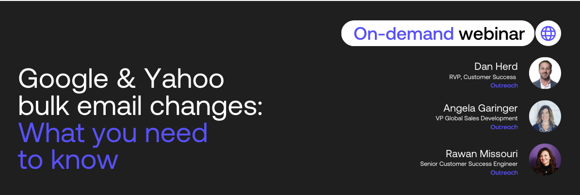
Outreach’s clear and informative email banner is extremely value-packed. The brand is promoting a webinar against a clean black background to ensure the focus stays on the webinar title and the presenters.
My favorite part is how Outreach included the three experts’ names, roles, and pictures. The design is simple and elegant. Bringing it all together, the email is an introduction to these experts.
What I like: There’s no logo on the banner. It focuses my attention entirely on the webinar’s content and the experts presenting it.
This decision might seem unconventional initially, but it allows the message about the webinar and its relevance to take center stage without distractions.
6. Holt Renfrew
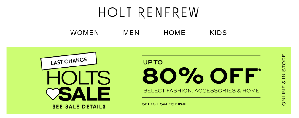
Holt Renfrew’s banner starts basic. The logo at the top and direct links to categories like women, men, home, and kids help me navigate the email more quickly if I want to explore their products.
The email shines in its vibrant promotion of the sale that boasts “UP TO 80% OFF” on a neon green background. This choice of color is bold and eye-catching and makes it impossible to miss the sale announcement.
Despite the potential for visual overload with such a bright background and including details like “select sales final,” the banner conveys all these elements without being overwhelming.
What I like: A neon green background is unconventional for a luxury brand, usually using more subdued, elegant color schemes.
Neon green grabs my attention and infuses excitement and freshness into the promotion to show that it’s worth checking out.
7. Uber Eats
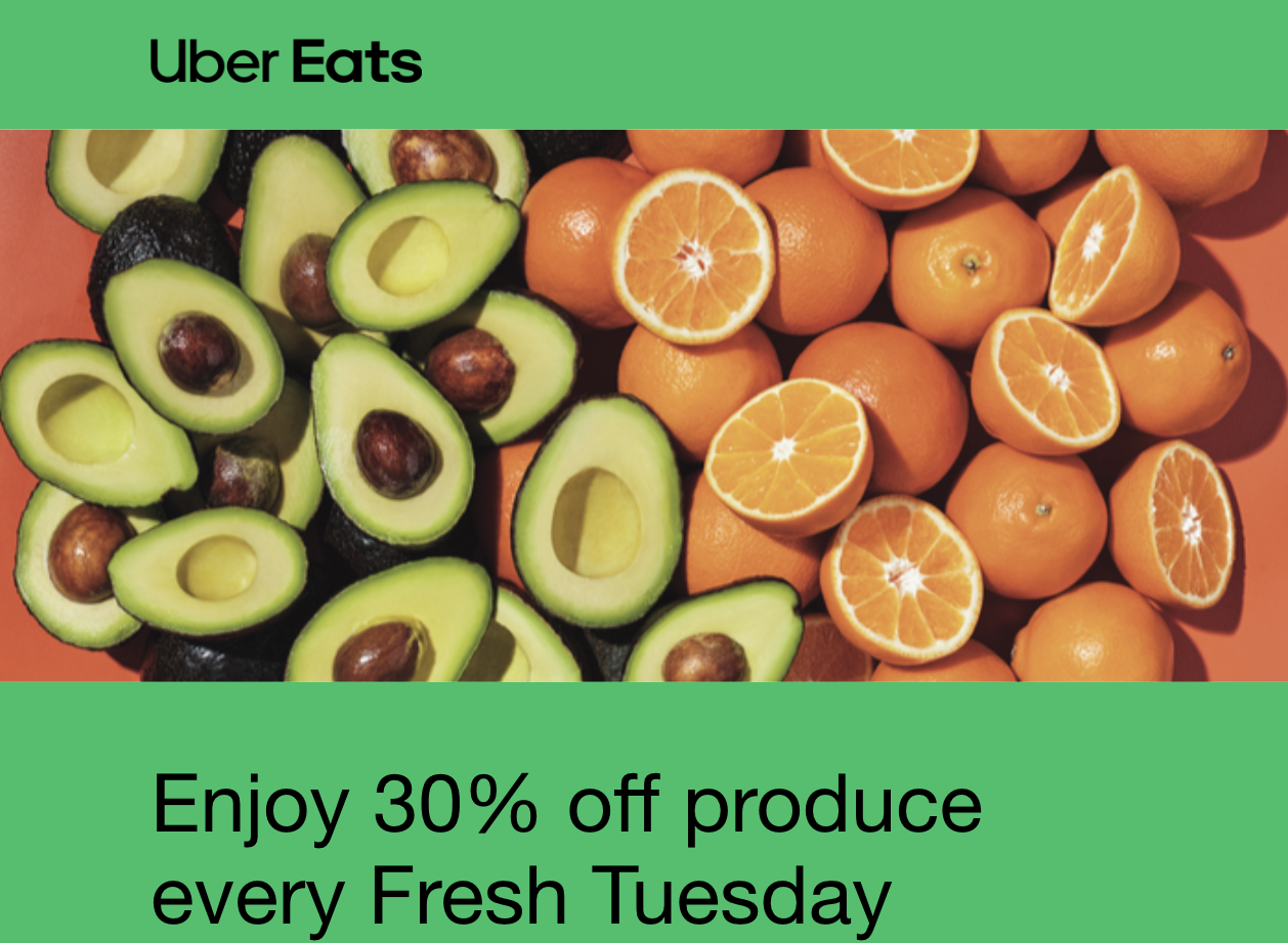
Uber Eats’ email banner stood out because of its colorful oranges and avocados. This shade of green in the background matches its brand colors and makes the fruits and vegetables look fresh.
The offer (“Enjoy 30% off produce every Fresh Tuesday”) is clear and builds excitement for weekly savings. It creates a sense of anticipation for weekly deals and encourages me to return and save on my fruits and veggies.
What I like: The banner is very straightforward. It communicates the deal without overloading me with details since the entire focus is on fresh produce.
Taking advantage of the weekly deal is tempting, and using brand colors and new imagery reinforces Uber Eats’ value to me.
Creating Email Banners that Work
Email banners require a lot of thought — and a lot of tact, too. They vary from industry to industry and audience to audience, so what works for one brand may not work for another.
So, how do you know what works? Simple: Test it out. Remember these fundamentals (and inspirations) to create a batch of email banners and see what works for your audience.
Monitor metrics like click-through and bounce rates to measure what engages your audience. A little trial-and-error pinpoints you to elements that click with your audience and make them take the actions you want.

![How to Write a Video Script [Template + Video]](https://vmkagency.com/wp-content/uploads/2024/03/video-outline.pngkeepProtocol-500x383.png)
![The Ultimate Guide to Google Ads [Examples]](https://vmkagency.com/wp-content/uploads/2024/03/adwords-ppc_4.webpkeepProtocol-500x383.webp)